I am working on making this better, but I have created a tribute to this time for my ceramics class project which thanks to Covid it is actually a cardboard project, which I will post pics of.
I am still working on removing the black from behind my pictures because it obviously conflicts with the background of the main picture. I am also working on the typography of the logo.
Warning: Long post, but mostly pictures with some commentary. Another Warning: If I share an artist work it will be clean; if I share the artist site, it may not be, entire at your own conscious.
I will be sharing some of my artwork with you as well. It is not all grand but, the concepts we learned were fun and interesting. Except perspective, I did not enjoy that assignment at all.
I really liked drawing this, My flag in some areas looks realistic but not in others. Myself and another student wasn't keen on the way the flag was displayed, but the choice wasn't mine to make and drawing a desecrated flag isn't the same as desecrating one.
We actually had a discussion about this, well the teacher taught on the view of respecting the flag and we were able to freely comment. Although the whole art class revolves around "patriotism" she did allow free discussion. Her view is that conservatives worship the symbols of American where as liberals patriotism is about freedom. Of course there are some on both sides with scewed views, conservatives are all about patriotism and freedom and that is why when we see a flag we respect what it stands for it. It is a banner, a guide on for hope and liberty. Any of our symbols are to remind us of past victories in freedom; the America Revolution, religious freedom and freedom for slaves. Our country isn't perfect, but we are free. Maybe we had to fight for those freedoms, but no where else are these freedoms upheld to a higher standard than in America. It's not about what we were but what we over come.
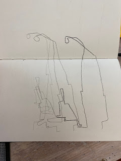
This was blind contour of a sewing tool I have. Because the neck was supper thin I would always get off course at the top which would exaggerate the bottom portion. But it made for a cool drawing. This was also done with three different pencil hardnesses.
This was a multi-view lesson based on my sewing tool. It was fun. It was hard (at the time) to come up with different view points of the tool.
Here we were practicing Picasso/Mondrian style of breaking down a picture from it's original to basic lines.
I laugh everytime I see this one. It is done with the same concepts as above, but more exaggeration of one picture. I still did not full accomplish the concept. I could do it know in hind sight, but at the time, I struggled with what I was doing.
Here is one of my perspective drawings. It is actually a hallway in a quilt shop and I didn't bother drawing the gazillion patterns on the left side wall. Nor some of the tedious quilt and it's details that were on the table and the right wall.
Another perspective piece.. Did I already say I hated perspective drawing? Yeah...
So this is of part of my kitchen area. The ceiling is vaulted, so no, it's not just a bad perspective ;).
This was kind of a fun piece. We had to do a collage of different objects we found. The tv was from the day I was sick. The fish tank in the cabinet is also from when I was sick. I find my fish humorous.
These are pen sketch that we practiced. I had more but they weren't as flattering. And although I don't mind transparency of my flaws (which I think are already self evident) these were just down right embarrassing.
On to Jim Dine. Most of his work is unappealing with some vulgarity, but I love his Tool Drawings. I would like to the tool drawings however, it is hard to find them all in one place. I suggest a Pinterest search to find them.
This isn't really all that flattering. I had forgot about this assignment and had to do it quick. The pots are suppose to look they are having a conversation.
An unfinished pen drawing. I actually really like pen drawing and hope to do more of it.
Pen drawing with water color. I think I will go back in and add blue to some of the open spaces in the tree and under the tree down through the fence. I didn't originally due this because I couldn't see it for all the distracting things that are were actually behind it that I left out.
This is some of the practice pieces for the above piece.
Larger thumbnail using the same objects.
This was our Final Project for the class. It was to represent how we feel about patriotism. This is my statement...
"The flag is high in mine to represent respect for what it stands for. The coffee pot represents us standing strong and nourishing the ideologies that protect our freedom. The egg is being held in such a way as to protect freedom because it is fragile."
Graphite on either 80 or 90wt. cream colored paper.
 Graphite on grey paper.
White charcoal o black paper.
Now I'm all caught up. I will try to be diligent about posting things I create over the summer. Some will be drawings, but I hope to do a lot of sewing, especially experimenting with free motion techniques to create master pieces (okay that may be a little over the top).
Dora
Cultivating Creativity


No comments:
Post a Comment